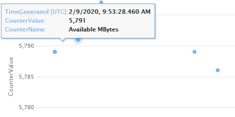
Azure Monitor Log Analytics has greatly improved the ability to visualize logs data. The new charts are a faster, easier way to visualize your logs and allow additional ways to get more insight from your data.
Fast
New charts render visualizations faster, allowing you to get insights quickly.
Beautiful
Smooth animation and transitions make the visualizations more appealing.

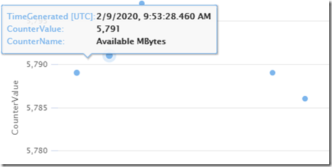
Improved tooltips allow you to focus on critical data.
Interactive legend
The chart legend is now responsive. Click a legend item to focus on its related data.

Supported visualization types
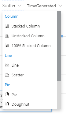
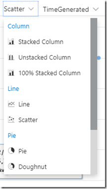
New charts in Log Analytics support the following visualization types:
- Stacked column
- Unstacked column
- 100% stacked column
- Line
- Scatter
- Pie
- Doughnut
- Stacked area
- Unstacked area
- 100% stacked area
Learn more about data visualization in Log Analytics.
We appreciate your feedback. If you have questions or suggestions, please email us.